Motion graphics make an engaging online presence, hence it pays to know the 2018 animation trends for websites. This is especially true if web owners care about their branding. After all, appropriate site animations help improve user experience.
Why Include Animation on Your Website?
Animation is what makes your brand’s story more captivating. It breathes life to simple graphics, doubling their impact on your web visitors. Now, if your website has been A-Okay without any animation on it, you probably won’t consider adding one this time. Well, you are totally wrong for thinking this way because there are tons of reasons to include animation in your website. Be it a business website, a blog, or any other kind, you certainly need some motion graphics on it.
- It keeps the user engage even before your website fully loads
- It hugely influences the user’s eyes, leading them to where they should focus
- It is a good way to tell a story or to teach your visitors how to use your website
Website Animation Trends to Expect In 2018
By now, you should have realized that using animation on your website is not just for the sake of being cool. It is one way to achieve improved user experience and navigation on your site. Animation trends for websites are usually greatly influenced by a host of factors. These include usability, technology, and public perception. Meanwhile, here are animation predictions that we believe will be dominant come the year 2018.
2D and 3D Graphics Combined
The year ahead will feature blending of styles in animation. In fact, it will be hard for viewers to identify where the 2D graphics end and the 3D graphics begin.
Smooth-Flowing Motion Graphics
Who wouldn’t enjoy a seamless animated presentation? We’re sure everyone would! While this type of animation can be more complex and time-consuming, your web visitors will definitely have their eyes on until it ends. Don’t you just think it’s time to switch your brand presentation into a smooth-flowing animated movie? Not only will this be very visually appealing, but it will also make your brand look more stylish. However, make sure to keep it short, let’s say 5 minutes or less.
Animated Typography
Next year will have brands, big and small, dressing up their logos into a moving typography. Imagine how well your business will register in the user’s mind by seeing such a playful introduction. This also works well on animated videos. If you’ve been paying too much attention of graphics and forgetting about lettering and typography, it’s time you change your attitude. Think of ways you can incorporate moving letters and form word images into your animation.
Embracing Liquid Motion
Have you ever heard graphic designers and animators saying “the more liquid motion, the better”? Well, it seems like this is going to be a part of next year’s visual imagery trend. Play with splashes, twists, bends, drops, swirled limbs, abstract smears, and others.
Right Mix of Grain and Noise
Almost all graphic designers are familiar with these 2 after effects. As a matter of fact, many viewers are fans of these animation effects. Normally, grain is applied to a stylized presentation that uses camera noise. The noise sets the right mood and aids you in successfully telling your brand’s story as well as in achieving your visual goals.
Use Animation on Your Website Like A Pro
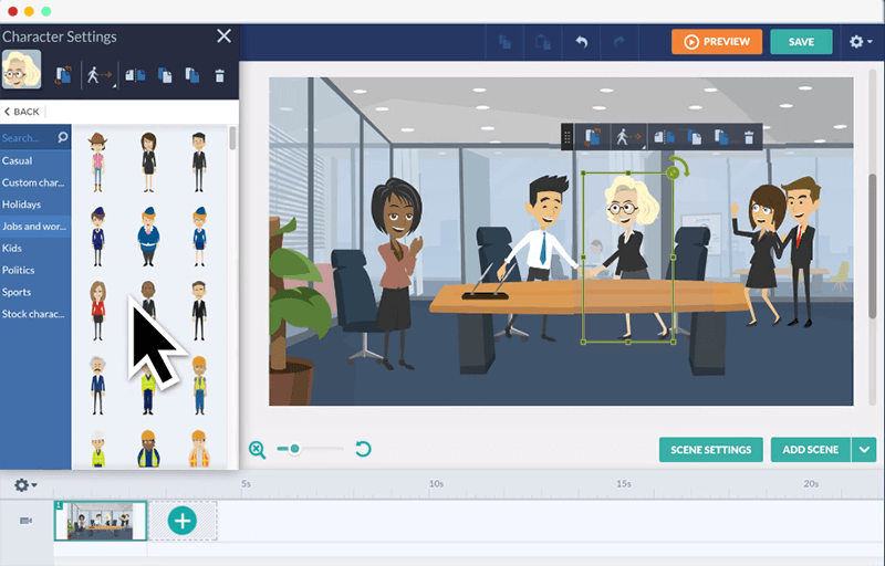
Now, if you think these trends will make you spend thousands of dollars, let us assure you that you wouldn’t. Besides, there are a lot of animation software that can help you stay in style this 2018. Plus, they are also very easy to use. Some of the recommended animation software are Clara.io, Pencil, Animiz, and Gimp. Might as well check each one out and play around with their wide-array of features.
Watch a stunning animated video created by Animiz
Start Creating An Animation Video with Animiz


